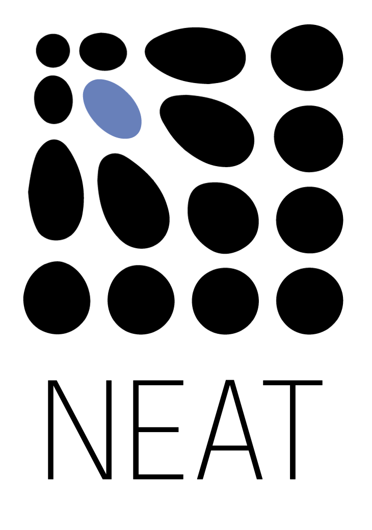
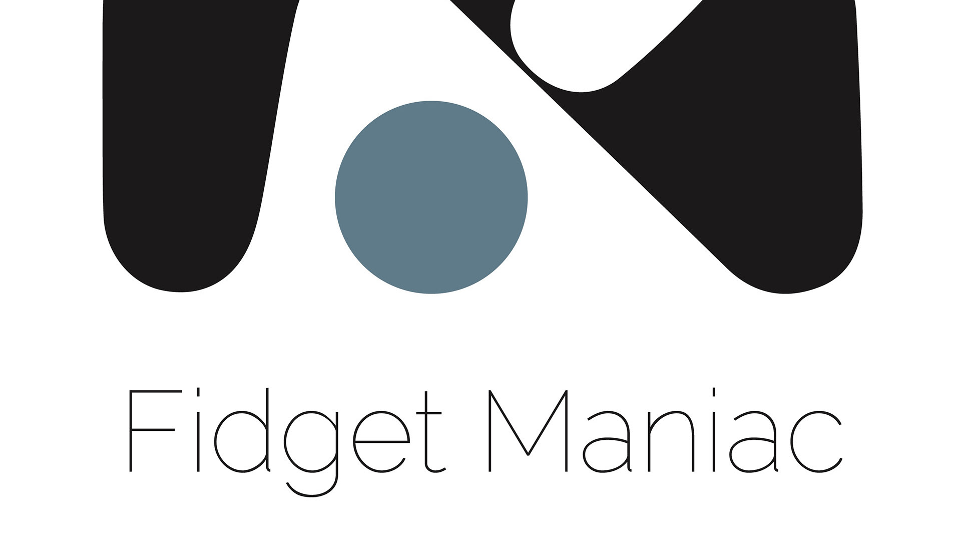
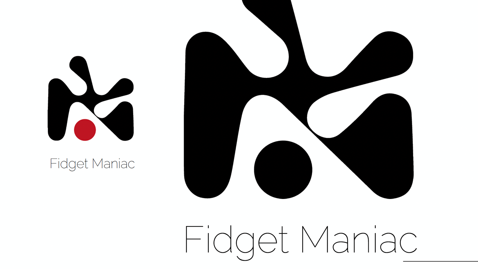
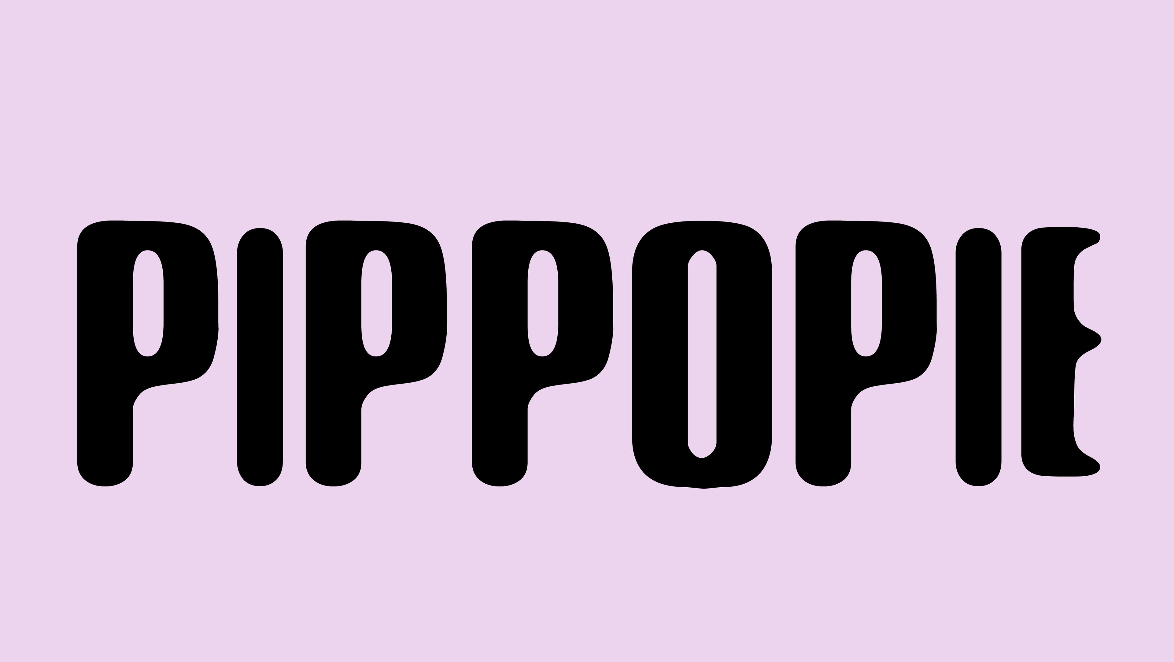
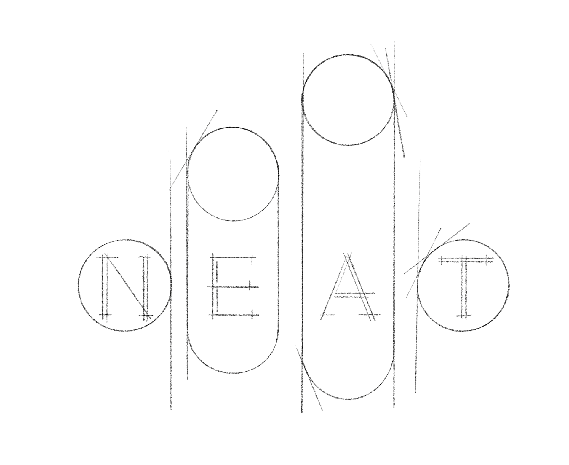
the rebranding of the logo was conducted with the PURPOSE of accurately representing NEAT's fresh identity while retaining the name within the logo.
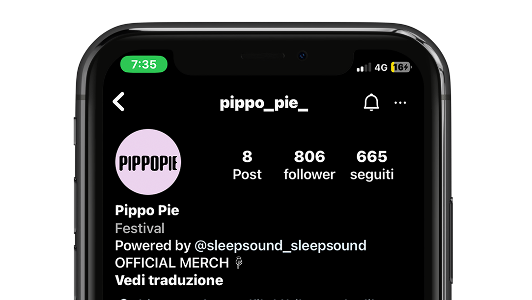
Considering the expansion of the target audience, four potential variations of the logo were designed to visually represent the different target groups that the agency caters to on a daily basis.
The chosen style is characterized by a minimalistic and modern graphic design.
the logo has been studied for both variants, with lettering or without.
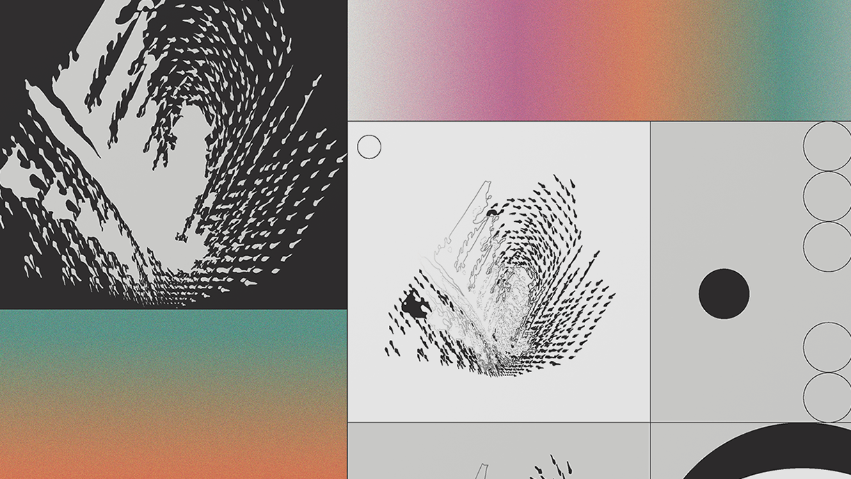
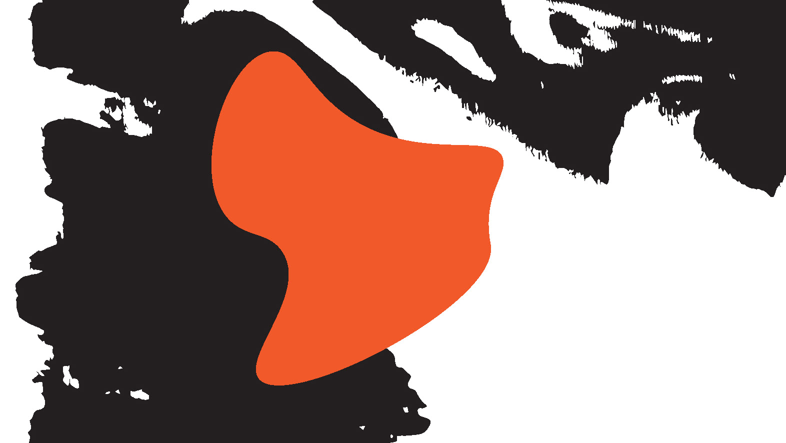
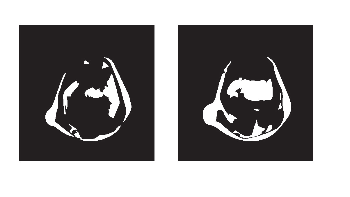
logo sketch processing


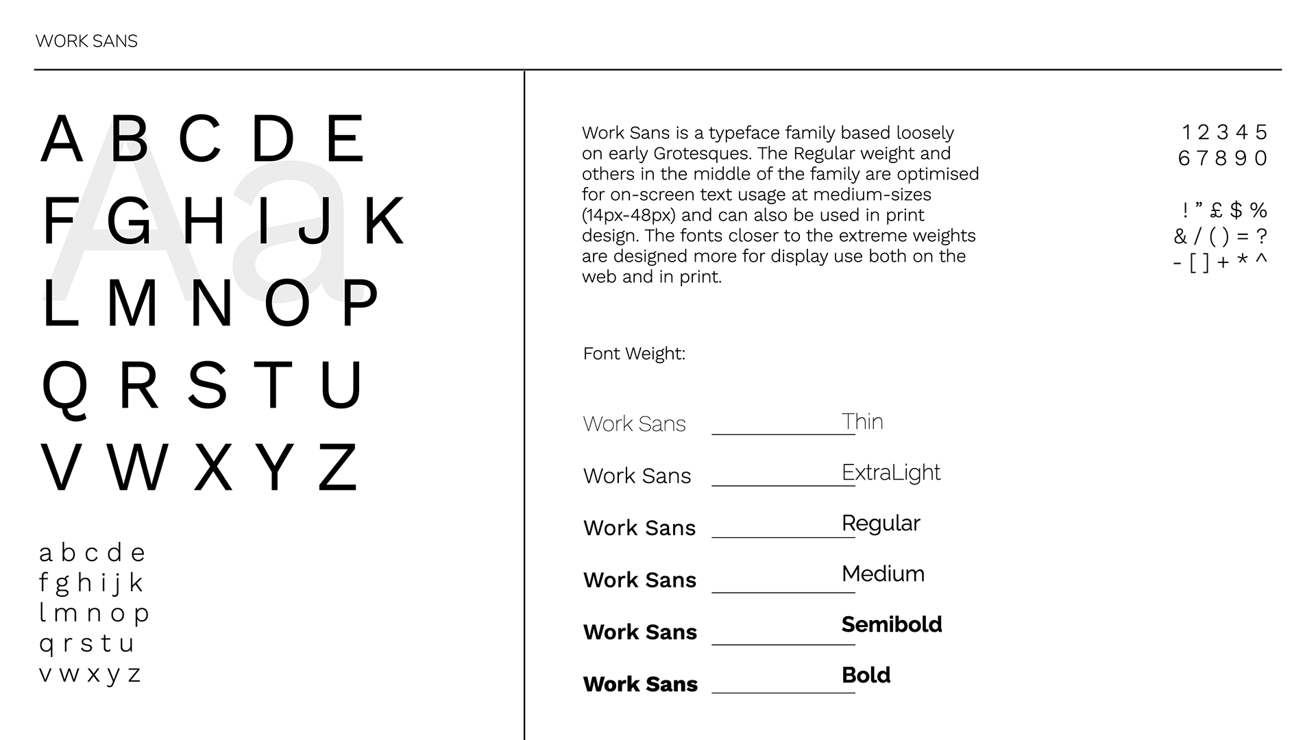
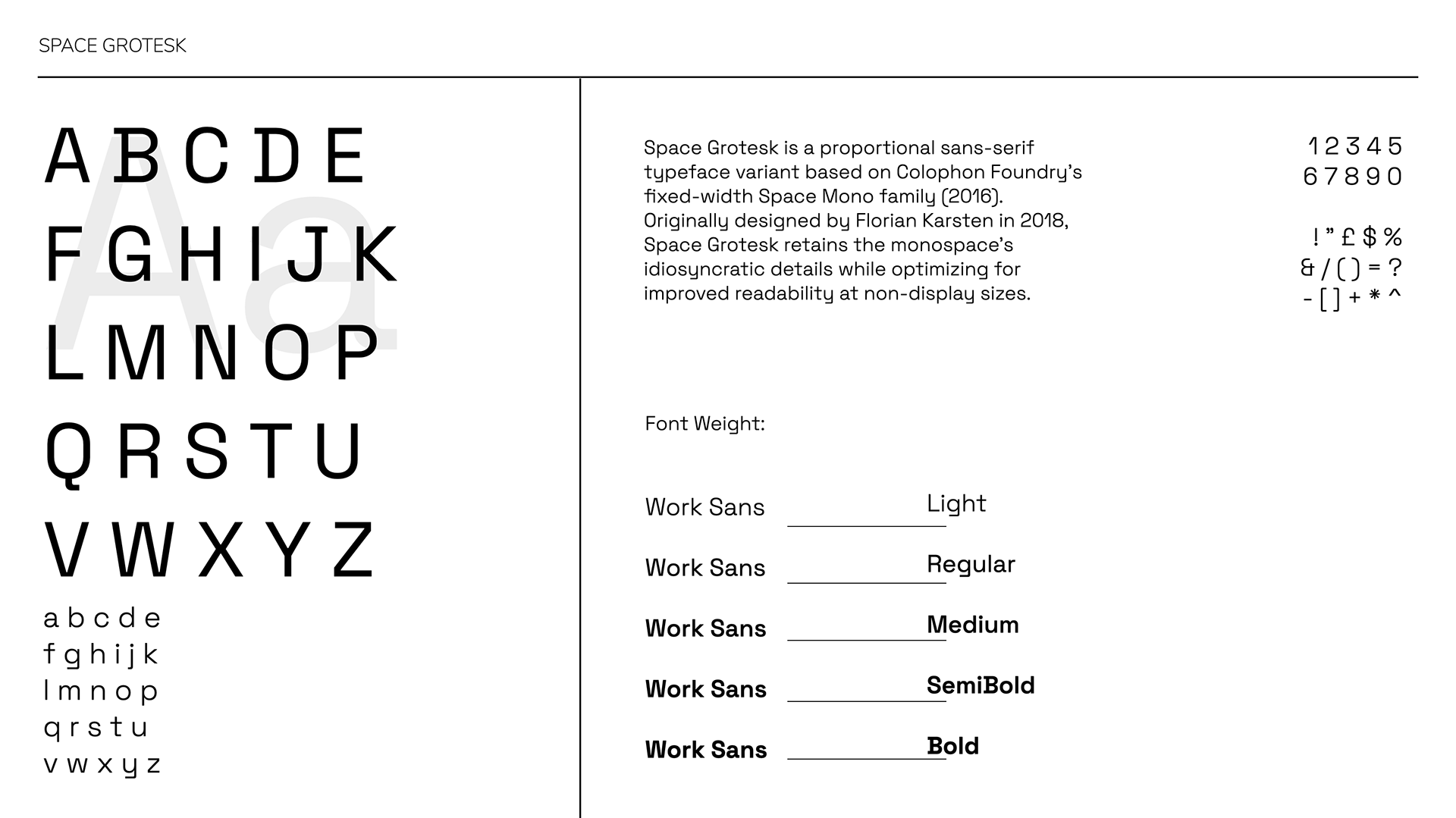
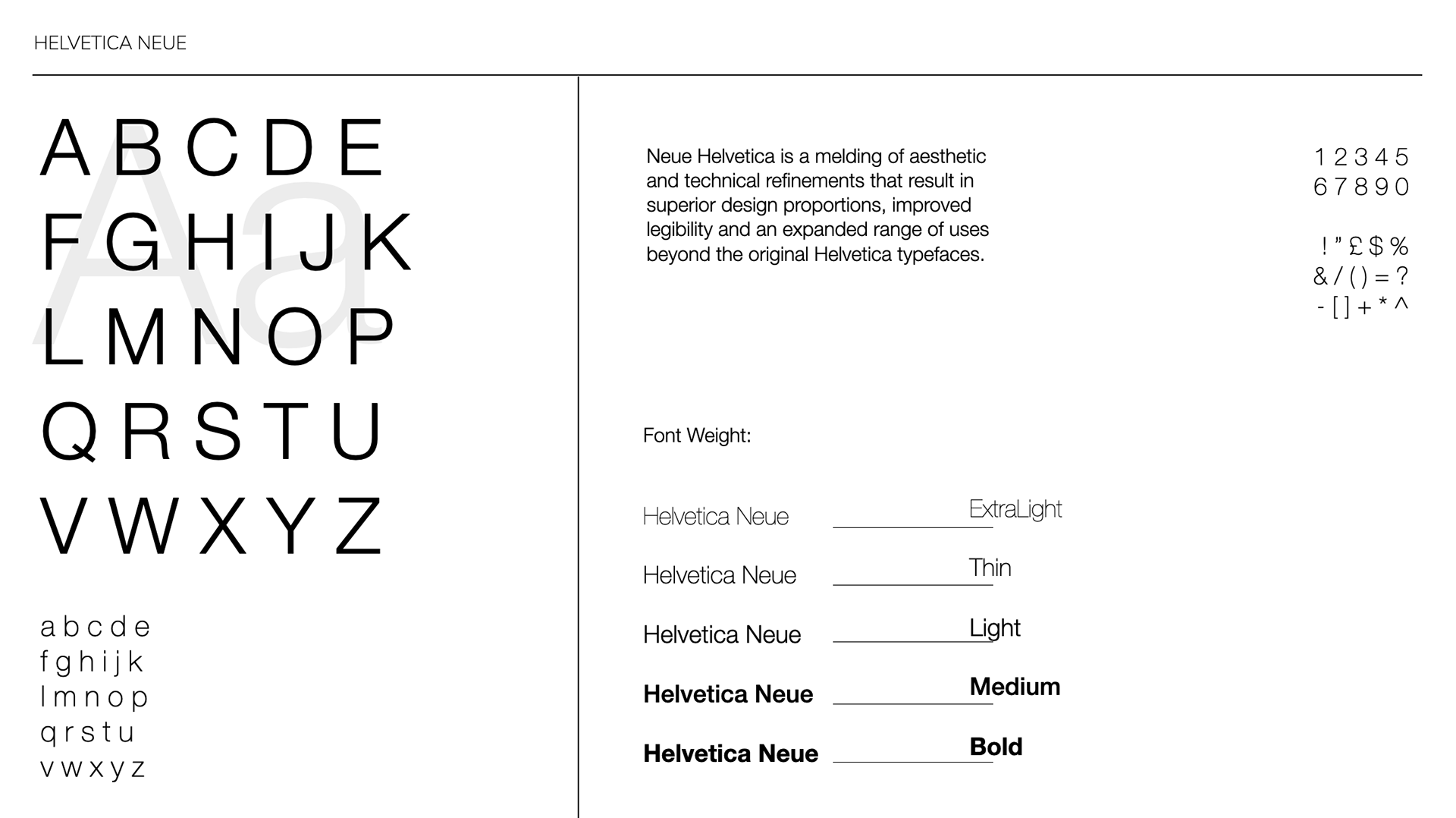
specimen font
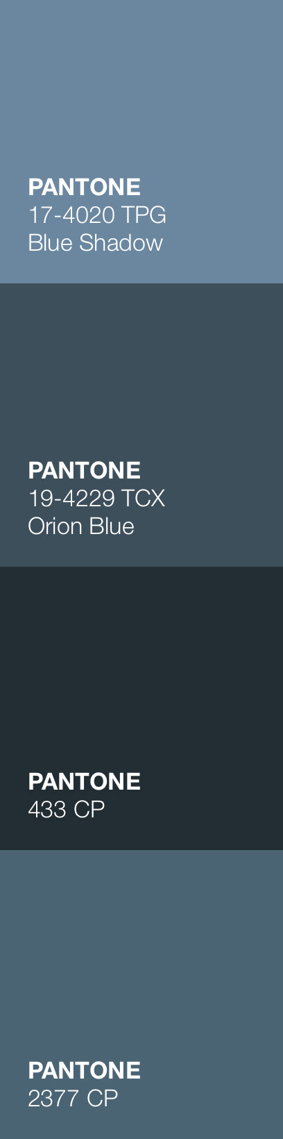
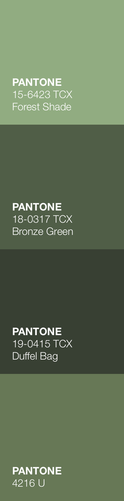
color palette

FINAL LOGO REBRAND